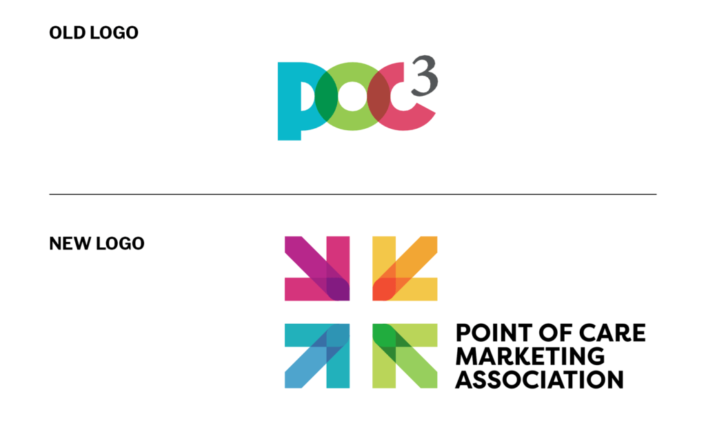
Our organization has evolved over the last six months. We’ve modified our mission statement, developed a vision statement, and changed our name and logo. This rebranding strategy reflects the transformation we are making in the Point of Care industry and provides a roadmap for where we are headed in the future.
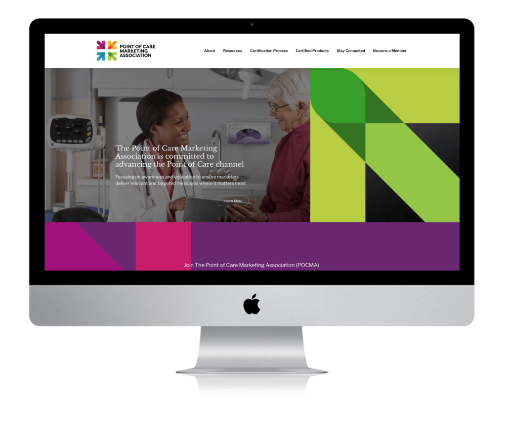
The Point of Care Marketing Association name is rooted in our commitment to clearly articulate who we are and what our focus is. Our new logo represents diversity and unity. The arrows’ colors symbolize our different member organizations. Their direction is unified, representative of our collaborative work toward a shared goal. The newly redesigned website will now serve as an educational resource hub for Point of Care industry stakeholders and prospective members.

The approach to determine the new name was methodical. Various name combinations were explored, and the elements needed to convey three things:
- The type of media channel we represent
- A descriptor on the type of services offered by our members
- The type of organization we are
Input was provided by members and the Industry Advisory Council. The definitions of the descriptors and alignment to our mission statement were also evaluated to determine the new name.
- Advertising vs. Marketing
- Alliance vs. Association vs. Council
Point of Care Marketing Association was approved based on the following rationale:
- Point of Care: placed at the beginning of the name to emphasize the type of media channel
- Marketing: provides a broader descriptor since our members deliver more than just advertising solutions to advance patient healthcare outcomes
- Association: an organization of people with a common purpose and having a formal structure is the best representation of the type of group we are
Next, we evaluated logos and sought one with a meaningful concept to represent:
- The many “points” of care that our members provide offerings at
- Unity among the different types of companies our members represent
- A fresh logo with elements of our original branding
Our new logo captures our new direction, the arrows reflect the different member types and the direction of the arrows symbolize unity
- The cross in the center is symbolic of healthcare
- The colors have elements from our prior logo while providing a fresh look
- The typeface is bold, and the unique font stands out
The development of a new website kicked off at the end of last year. The goal of the new website is to:
- Serve as an educational resource for the Point of Care marketing industry
- Demonstrate our core objectives and strategic vision

